Designing the Variant Cover for CHAPTER 7
Ester is our colourist here at A Place in the West. She's a huge part of our team whose style and artistry help shape the comics you read. We love her to bits, which is why it made perfect sense to us to ask if she'd like to produce a variant cover for the comic. We were thrilled when she said yes, and the final result was amazing.
Here Ester explains the process of bringing it to life.
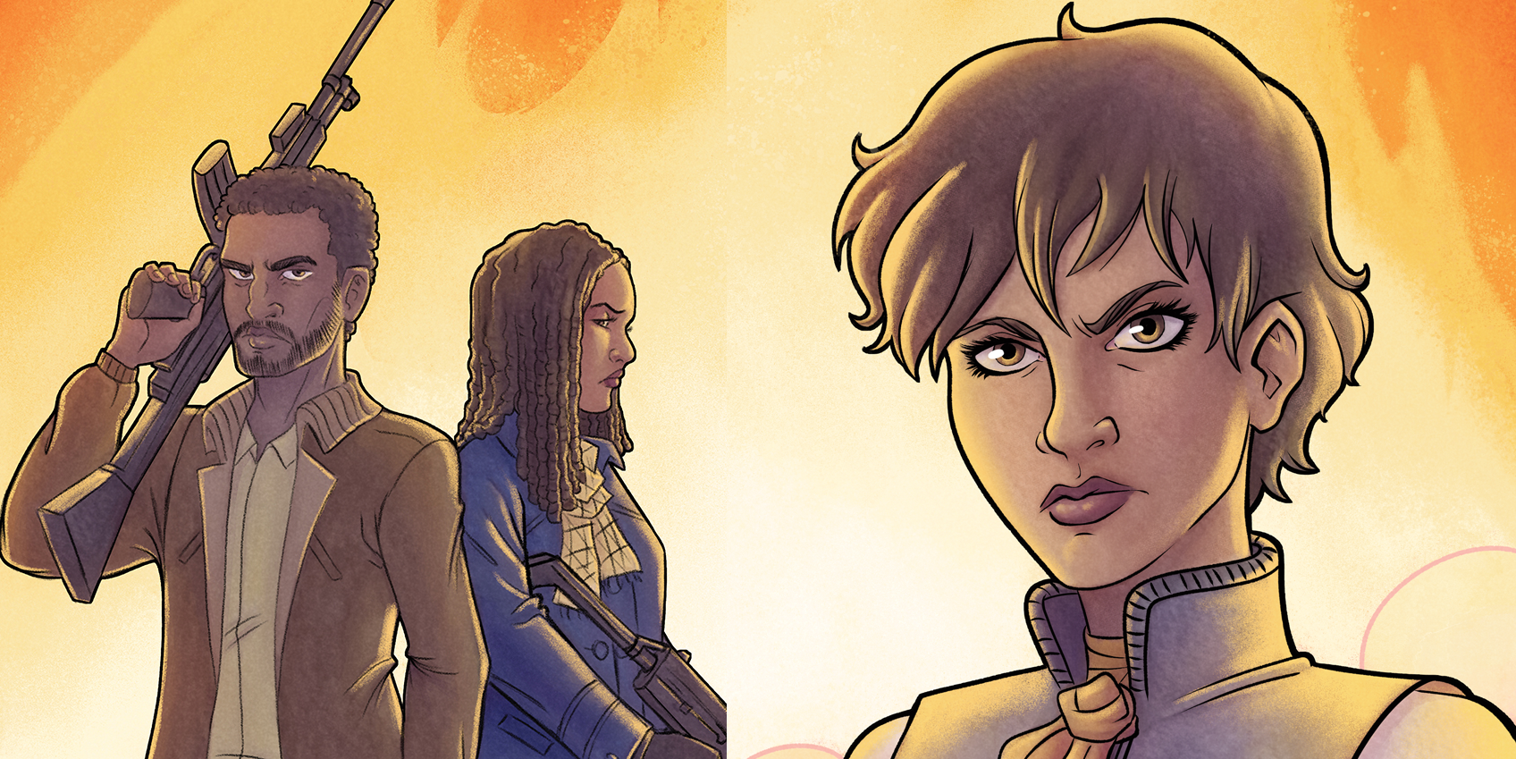
Hello, I’m the colourist for Half Life: A Place In The West, and a few moths ago I received an amazing and great opportunity: to create all the art for a variant cover of Chapter 7; the first variant cover of this comic and also my first alternative cover. I was so happy and also very nervous about this and maybe that’s why I went into a long process to figure out how to make this variant cover.
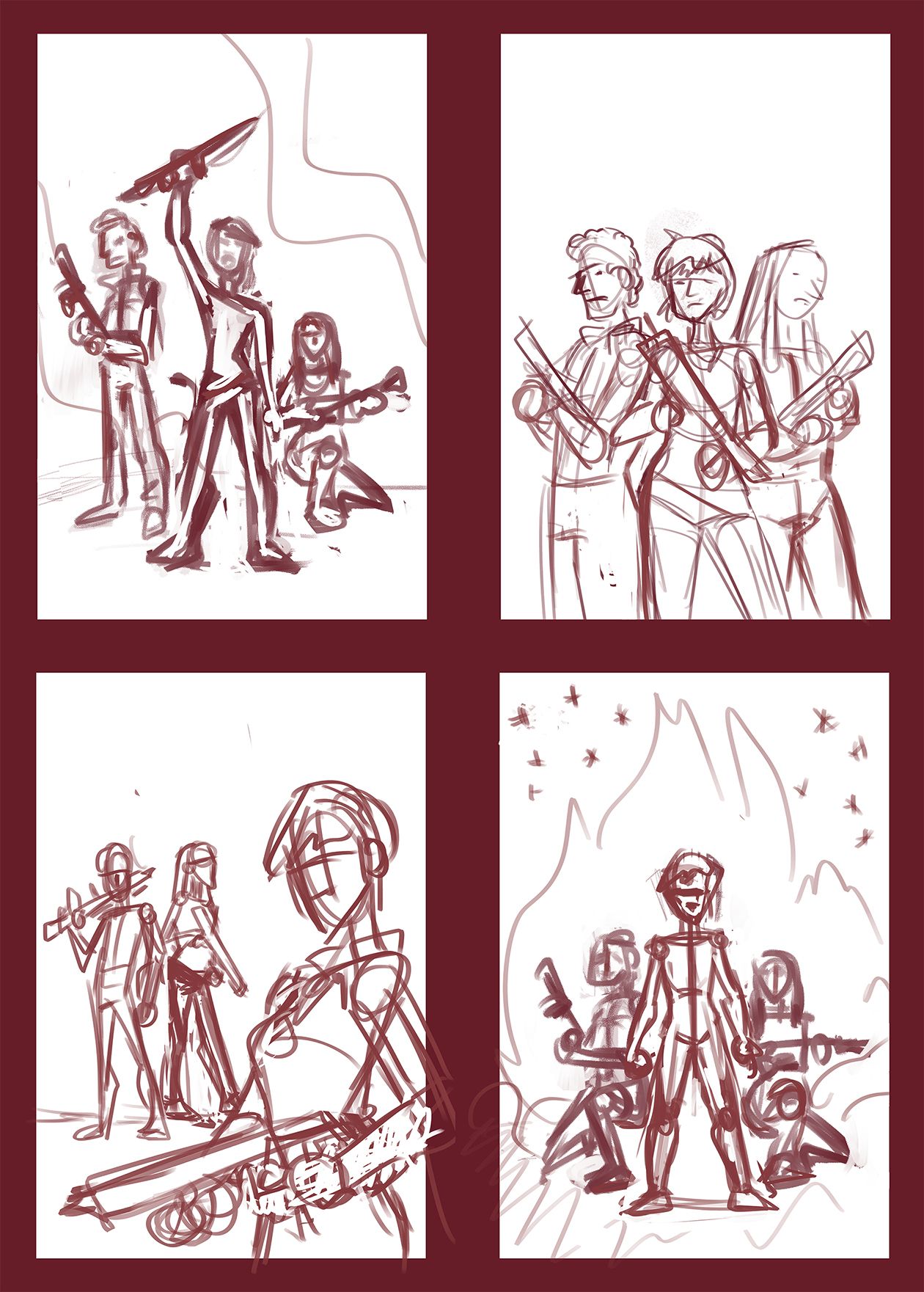
Ross gave me the first direction to feature Sejal, Jacob and Leaf on this cover. With that in mind and with the tone of tension of the whole chapter I first did some layout sketches to establish the composition. I drew about ten of these quick sketches, but I only sent for review the four that I thought were the most interesting and I would be happy to draw. This cover has to show these characters in a tense attitude with their weapons ready for what is coming and how Jacob and Leaf support their leader, Sejal – a very strong and intense woman. And, of course, fire and a sky full of stars are things that I love to do in A Place In the West comics pages and so they have to be here too.
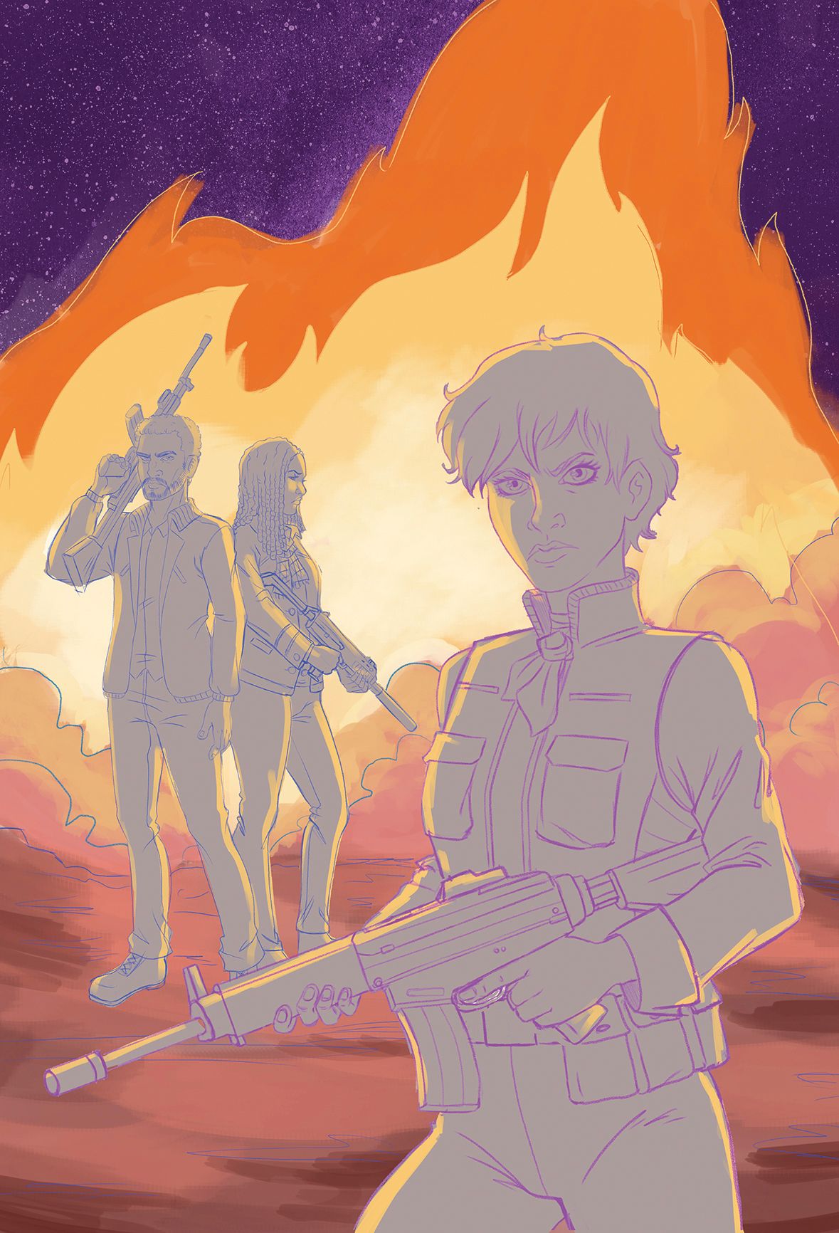
With the layout sketch approved I kept doing the pencil drawing in Clip Studio Paint. I’m not a fast penciller: I like to draw and redraw to test different options, and digital sketching helps to do this and also allows me to pay attention to small details. So, I made a drawing of the whole composition and then I cleaned up the line art. I also did a digital colour study to establish the scheme I’d be working with. I was moved to use a blue sky in contrast with the orange of the fire, but Ross gave me a clever direction: a purple sky was a better choice because we use a lot that sky in this chapter and also purple is one of the main colours in A Place in the West.
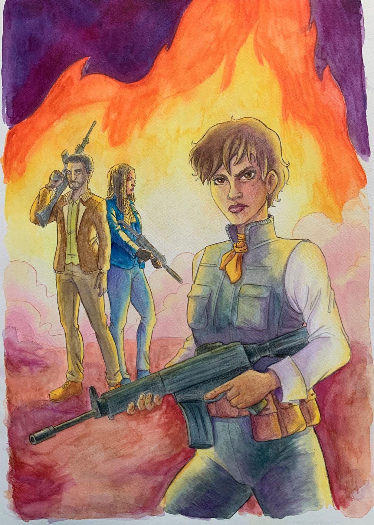
I had in mind to continue the colour with watercolours traditionally, and that means printing the line art, copying it to the watercolour paper and beginning with the paint. Watercolours is a technique that I really love, and I enjoy using it, but unfortunately this was a difficult piece compared to others I've done before and the result was not what I wanted.
While I usually paint a single character on a simple background, here we have 3 characters in a firelight dominated environment. The first problem was that I lost the details of Jacob and Leaf's faces, and I loved how they’d turned out in the digital pencils. The big disadvantage with digital media is that you can zoom in on a lot on things that will not be seen. And the second problem was that didn't get those smooth colour transitions that are supposed to be in watercolours, and some part ended up with dirty strokes, especially in the background. I thought I could fix these things if I kept painting it, but after going through the whole process I was not totally satisfied with the result.
I decided to redo the background digitally, again back in Clip Studio, where I first painted the fire, ground and sky. As a curiosity, I always add a real watercolour texture on the skies in the comic pages of A Place In The West, and also here in the cover. It is something I learned from the previous colourist in the pre-remake version of A Place in the West, Heath Heil, and I incorporated it into my workflow with my own watercolour textures.
In order to separate background and figures, I inked the outline of these, since my intention was to incorporate the watercolour I had done before, because I like the combination of yellow lights and purple shadows that I got in the characters. But it didn’t integrate well, so I inked and coloured everything digitally. I didn’t want to give up to the watercolour feel, so I added the watercolour painting back on the characters with low opacity.
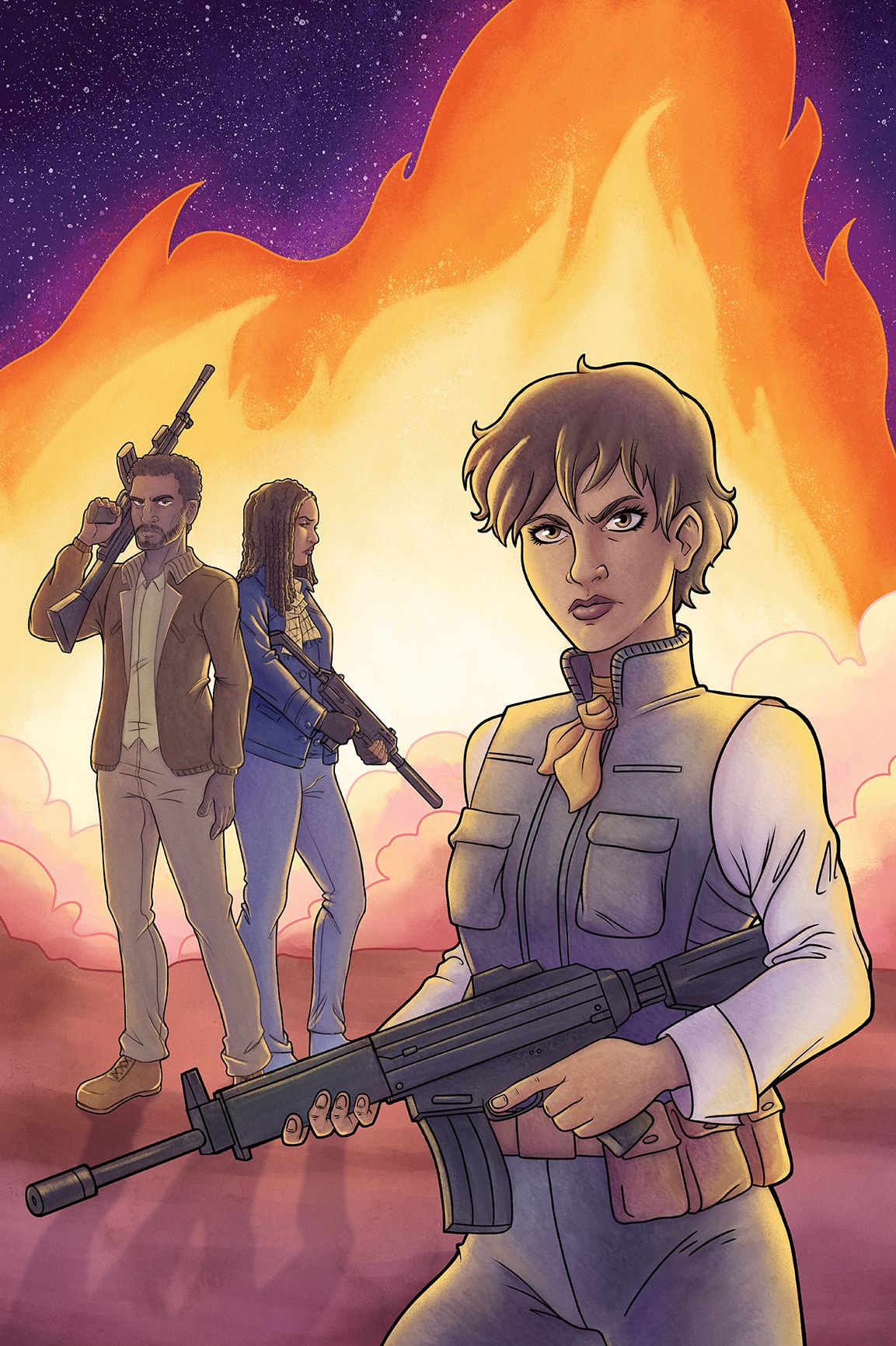
I have learned a lot of new possibilities in this cover. It has been a very chaotic process, but it has allowed me to experiment and find a way to combine the digital and the traditional.
I have to express my complete gratitude to Mike and Ross, they are very supportive with my art and I feel very lucky to be part of the amazing team of A Place in the West.
Ester Salguero
You can follow Ester and see more of her work on Instagram and Twitter.
